Hi friends, its Jodie here with you today with a Project Life post.
I’m noticing a few 2014 Project Life spreads still being blogged here and there, so I’m in good company in finishing up my Week 40, which takes me to the start of October.
Here’s the left side:
And the right:
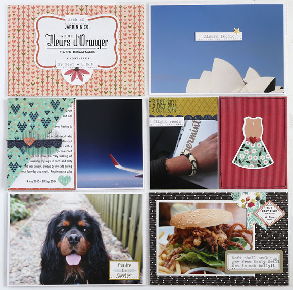
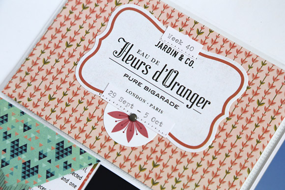
I’ve used Basic Grey’s J’Adore collection this week, working with the 6×6 paper pad and ephemera pack.
Because I was grieving the sudden loss of our fur baby Daisy, I spent most of the week curled up doing not much at all, which means aside from one photo of Daisy the rest of my spread is about the weekend, which we spent in Sydney on a pre-booked holiday. I still had plenty of photos of Sydney so I had no problems filling up my spread for the week.
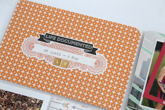
I love all the vintage French perfume references in the ephemera pack and some of the patterned papers. For my title card this week I’ve layered two of the ephemera pieces, typewritten the week number and dates in a strip journalling style and stitched them down.
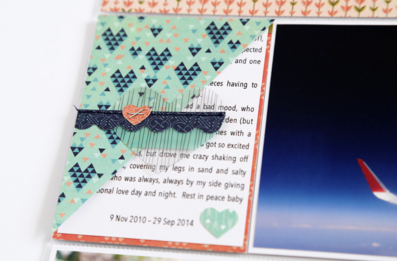
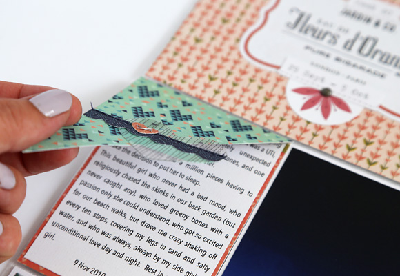
I knew that I wanted to include journalling about losing Daisy, but also that I didn’t want it on immediate display, so I created this partial flip pocket so that the reader would need to lift the pocket to read the full story. I trimmed a piece of paper to 3×4″ and cut it in half on the diagonal. I layered an acetate heart from the ephemera pack so that it overlapped the paper, and added a scalloped strip piece and some extra hearts.
When you lift the flip pocket you can see the full story.
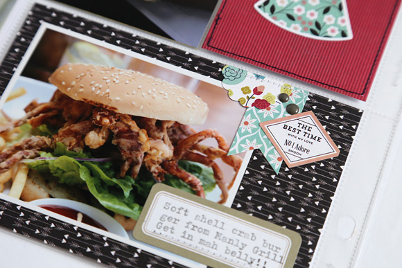
And then on to Sydney. I couldn’t not document the amazing soft shell crab burger from Manly Grill. It’s a bit funky to look at but gosh it was delicious!
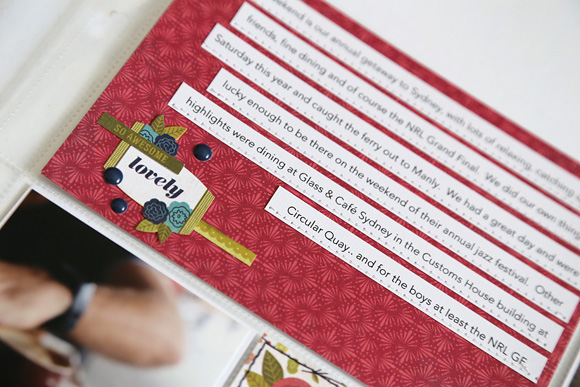
Some more strip journalling detailing the highlights of our weekend away.
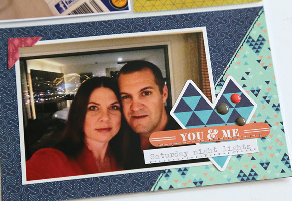
And a selfie taken in our motel room before going out to dinner one night with the beautiful lights of Darling Harbour in the background. I used the remaining half of the 3×4” paper from my flip pocket to add some interest here, and it created a base for an embellishment cluster at the side of my photo.
Thanks for dropping by the Papercut Labs blog today!
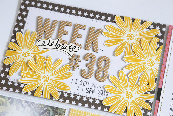
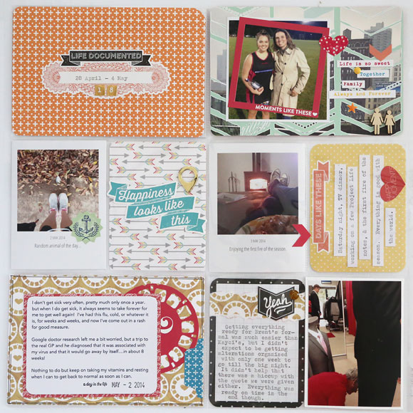
Hi everyone, it’s Jodie here with you today with my Week 38 Project Life Spread!
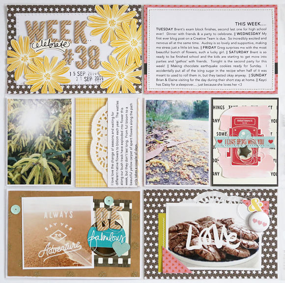
This week I thought I’d try something different for my Project Life supplies, and use a kit from a kit club. I decided on the October main kit from A Piece of Cake Designs. My photos for week 38 had touches of yellow, sandy beiges, some pinks and turquoises, so I used that as my colour palette and pulled coordinating papers from the kit. I also added some black and white papers and cardstock for contrast.
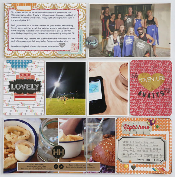
Here’s the left page:
And the right:
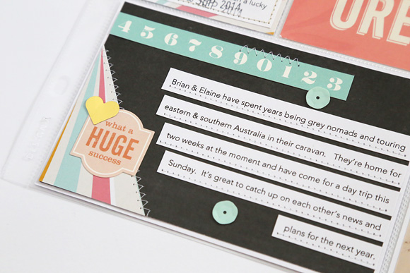
I’ve kept one 6×4 pocket on the left side for journalling in a ‘review of the week’ style, and added extra journalling in separate pockets for anything I wanted to expand on. By doing a summary pocket you can easily run through the highlights of the week. I’ve typed my journalling on my computer, highlighting the days of the week in capitals so that they easily stand out.
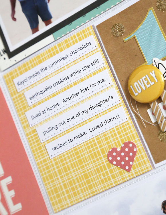
It’s important to me to record the changes in seasons as well as family happenings. This week where I live the wattle trees were in full bloom and I’ve included a photo of them in flower, and another photo from a few days later as the flowers dropped and our paths turned into a yellow carpet from them. I’ve drawn inspiration from the wattle flowers for my title card and fussy cut some yellow flowers from one of the patterned papers, scattering them around the card. I’ve used some Thickers for my week number and stitched through them, both to hold them in place on the card and for some added texture. I’ve then used a date stamp to add the actual dates of the week on the card.
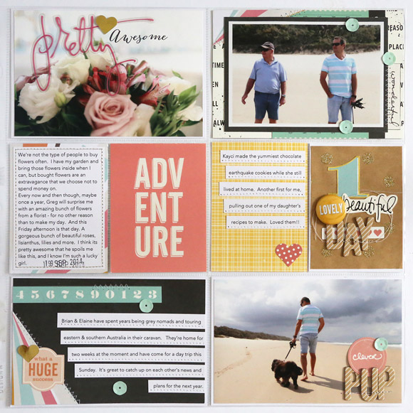
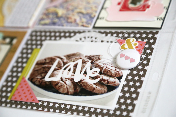
I’ve digitally added the scripted word “Love” to the centre of the photo of my homemade biscuits. It’s a freebie by by Polka Dot Creative that can be found in the A Piece of Cake Designs digital store here.
Machine stitching journalling strips has been popular for quite a while, and has mostly been stitched right through the middle of the words. I’m loving the new trend of stitching at the bottom of the strip below the text, and I’ve done that here with some white on white stitching.
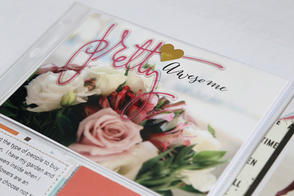
This photo of some beautiful flowers my hubby bought for me doesn’t need too much embellishing. I’ve used the little bit of whitespace left in the photo to add one of the Heidi Swapp acrylic words that came in the kit, and stapled it straight to the photo with my Tim Holtz Tiny Attacher. I’ve then covered the staple with a gold foil heart so that it’s completely hidden. I’ve had this “Awesome” stamp from Kellie Stamps in by stash for a while now, and it fit perfectly with this photo. I’ve used Stazon ink and stamped it right on my photo.
For this 3×4 pocket I’ve cut down a gold glitter brown paper bag and used it as a background paper. I’ve then just layered some stickers, Thickers, and finally a cherry flair button. Again I’ve stitched the Thickers down, and have left the loose threads fall where they want to inside the pocket.
I used some chalkboard paper as a base for this card, adding one corner of patterned paper and part of a title strip. Many companies are incorporating extra designs onto their title strips so be sure to check them out before trimming them off and discarding them! These numbers in a row are the perfect addition to this card.
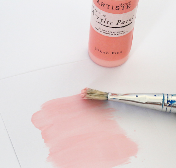
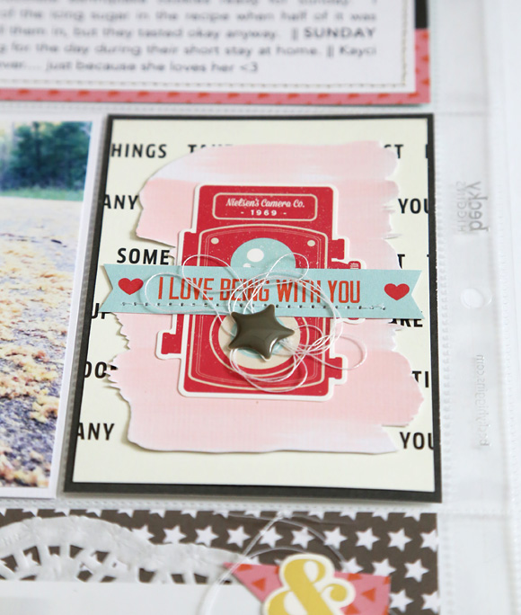
This is another filler card that has come together quickly. Starting with a background of a neutral patterned paper matted onto chalkboard paper, I’ve then grabbed some acrylic paint in a coordinating colour, and brushed a few horizontal brush strokes with a large brush on a spare piece of white cardstock. Once dry I’ve fussy cut around the painted area, being sure to pay attention to the intricate edges of the brush strokes. Then I’ve layered that piece, a vintage camera sticker, some text from another title strip that I’ve trimmed down and then stitched, and finally added a star enamel dot with some extra loose threads. One of my favourite things to do in my PL is create little layered filler cards like this!
Hi everyone! It’s Jodie here with you today and I’m super excited to have my first post on the Papercut Labs blog as a Project Life contributor!
My Project Life style is a little bit structured, but I also love to add in layers and lots of little embellishments. I do use Project Life cards, but most of the time I prefer to use 12 x 12” patterned paper or a 6” paper pad, and make my own cards.
I have my Week 18 spread for you today with a few tips, so lets get started!
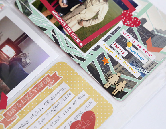
Here’s the left side.
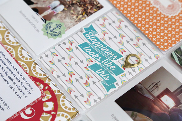
And the right.
This week I’ve used Echo Park Paper Co’s Capture Life collection. I’ve pulled a few patterned papers and this sticker sheet, which has lots and lots of embellishment options to choose from. I’ve also used two 3×4” cards from Becky Higgins’ Midnight edition core kit.
I’ve kept my title card this week fairly simple. I attached a label sticker to the centre of the card, which I then fed through my vintage typewriter, centering my dates on the sticker. Now, I’m (just…) old enough to have had typewriter lessons in high school, but for anyone that has grown up in the digital age, here’s a tip on how to centre your text on a typewriter.
First, feed your document through the roller until you have the line position correct. Use the space bar to move across to where the centre of the text will be (in my case this was the centre of the sticker). To centre the text we will need to backspace exactly half of the total spaces used, including letters, numbers, punctuation, and also any spaces.
The easiest way, I find, to do this is to backspace once for every second letter (or number, punctuation or space).
Using the text you want to type, say each letter out loud (remembering to include numbers, punctuation and spaces), and backspace once every second letter. So for my example of “28 April – 4 May”, this is how I backspaced. 2 8 (backspace) space A (backspace) p r (backspace) i l (backspace) space hyphen (backspace) space 4 (backspace) space M (backspace) a y (backspace). From that position you’re now…type away! Try this method and you’ll find you have beautifully entered text every time.
Because I had journaled about this photo on my right page, I chose to just add a few phrase and word strips from a Cosmo Cricket Tiny Text sticker sheet to this card, and added some enamel dots and Studio Calico wood veneers to represent Mum and daughter.
This simple filler card was made from patterned paper cut down to 3 x 4”. I wanted to use the banner sticker, but if you look closely you can see that it was just a bit too wide to fit in the pocket. Because it had good adhesive, I positioned it where I wanted it, and stuck it directly onto the outside of the plastic pocket. I really like how it overlaps the pocket just that little bit. I adhered the gold foil geotag to the patterned paper and slid it inside the pocket.
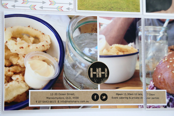
On the right page I had two 4 x 4” photos to use, but since I’m using a Design A pocket page, there are two pockets across the bottom that are each 6 x 4”. To work around this I trimmed my right side photo in half at 2”. I then adhered the remaining 4 x 4” photo and left side of the photo I cut in half to a 6 x 4” backing card to make sure they stayed in position. This slid into the left 6 x 4” pocket. I adhered the right side of my cut in half photo to the very left of another 6 x 4” backing card, leaving me a 4 x 4” journaling space on the right side of the photos.
The memorabilia on these photos is from the menu of the burger cafe I took the photos at. Because the menu was a single A4 sheet I didn’t feel too bad about swiping one for scrapbooking purposes. I might think twice about it if I was at a swanky restaurant though! (Taking a discrete photo of the menu like I did here is a better option in that situation ha!) I used a circle punch to punch out the café’s logo from the top of the menu, and trimmed a strip with some basic info about the café, which I backed with white cardstock to make it pop off the photos a bit more.
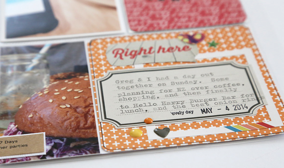
To finish off the remaining 4×4” journaling space I cut patterned paper to size, layered a frame and element stickers, and typed my journaling onto a label sticker. Finally I added some more enamel dots, and that’s Week 18 done!
Thanks so much for dropping by the Papercut Labs blog today!
